I have spent the last couple days working on my Practice Log application. I make the website for downloading the application nicer looking, wrote some documentation, created a simple web application and added a couple features to the android app.
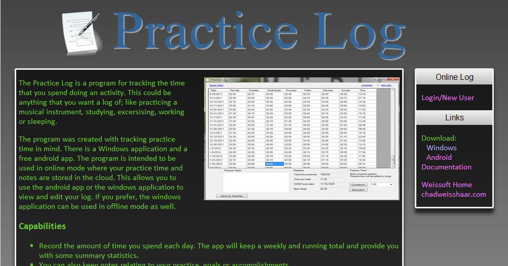
The website: weissoft.com/practicelog looked pretty bad and may have been discouraging people from downloading the software. The new look is better:
I am not a web designer, so it is still lacking some polish. I used some of the css from the wordpress theme that this blog is using and the free icon that the application itself uses.
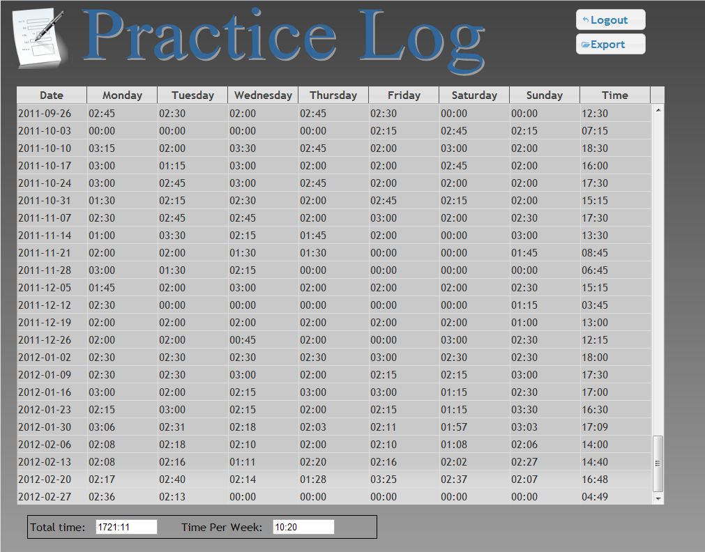
The web site allows you to login and see/edit your log. It is not as full featured as the windows application, but it provides a way for the users of the android app to access their log on a large screen and, more importantly, to export their data. Here is what the site looks like today:
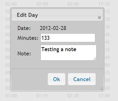
This site uses the same color scheme as the main practice log page and jquery-ui buttons and dialogs:
If you haven’t used jQuery before, it is very, very nice. I strongly recommend it. There is a bit of a learning curve and it makes some callback functions look uglier. But the benefits are huge. Making that dialog would have taken me hours without jQuery. Here is the code to do the login dialog:
<div id=”login_dialog” title=”Login”>
<form name=”login”>
<table>
<tr><td>Username:</td><td><input type=”text” name=”username”/></td></tr>
<tr><td>Password:</td><td><input type=”password” name=”password”/></td></tr>
</table>
</form>
</div>
  $('#login_dialog').dialog({
    autoOpen: false,
    modal: true,
    buttons: {
      "Ok": function() {
        // Call the php to login
      $.post("../login.php", {
        username: document.login.username.value,
        password: document.login.password.value
        }, function(xml) {
...
        });
      },
      "Cancel": function() {
        $(this).dialog("close");
      }
    }
  });
And that includes the some of the code that actually logs the user in. jQuery also makes it easy to operate on a set of page elements or XML. The most difficult part of developing the web site was getting the table body to scroll without the table header scrolling too. I’ll make a separate blog entry for how I solved that problem since it took me a while to figure out. The majority of my time was spent picking colors and tweaking layout. Somehow html layout is very non-intuitive to me and it takes me a long time to get things looking the way I want. The export button prompts the user to download a .csv file of their data. This works by setting the location.href to a server side php. The php script sets the Content-Disposition header to the file and then writes the CSV data to the output stream. Here are the interesting lines of code:
  header("Content-Disposition: attachment; filename=practiceData.csv");
  $outStr = fopen("php://output", "w");
  while ( $row = mysql_fetch_assoc($result) )
  {
    $data = array($row['day'], $row['minutes'], $row['note']);
    fputcsv($outStr, $data);
  }
  fclose($outStr);
I also made a new version of the Android app. Navigating between days was non-intuitive and slow. The only way to change the displayed day was to swipe left/right on the main screen. That method still works, but I added a couple of buttons to make it more obvious. I also added the capability to click on a particular day displayed in the week view to change to that day. You can now swipe left/right on the week view to go back/forward 10 weeks and the days with notes are highlighted. I made the note section expand to fill the available space on larger devices and added a menu option that takes you to the website so that you can export your data.
Updating the android app was quick and mostly painless. I added the new .apk to the marketplace and was able to download the update to my phone after 10 minutes or so.


